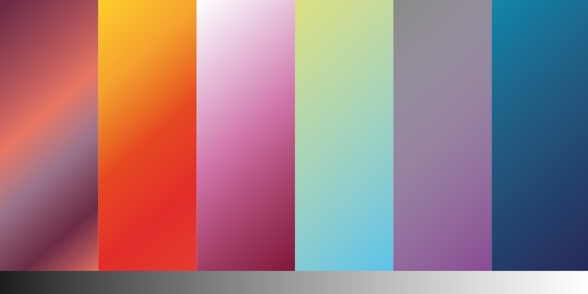
Choosing a Gradient
If you look at all the social platforms, it has probably come to your attention that a gradient is trending - pretty much taken over the flat backgrounds that we are used to seeing. We've seen the social brand logos in a solid colour carefully laid on a gradient of harmonising colours. Would this work for all business branding? Currently, most are giving it a go although we can't imagine the NHS rebranding their logo to incorporate a gradient. You might think it is a fad, which might be true, however incorporating the main company colour in a brand guideline will give you the option to drop the gradient when you do not need to use it such as supplying a flat logo to a partner agency or using your logo on print where you cannot use the gradient.
Choosing the right colours to print a gradient isn't always an easy process, especially when you choose many colours. The easiest way to have a gradient printed without it looking grainy is to use long lengths so it blends smoothly which is usually at 50% for 2 colours, which can avoid banding. However, if you are using complete colour opposites you may need to add a mid colour which can reduce the grey. Light to dark often appears grainy such as blue to white, so adding noise or a gaussian blur can help to blend this a little more smoothly. You do not need to fixate on the 50% rule, amend this accordingly so with 3 colours you can use one blend at 25% and the next at 70%; as long as the blend is smooth.
If you are designing artwork with a gradient, whether it be as a background or a part of a logo (like Instagram) your gradient doesn't have to start within that shape, especially if you want the blend to be at different locations. Working outside the shape then dragging the gradient at the angle you need can work well without it looking too regimented. In a colour palette 5 colours may work together but adding these colours to a gradient might not work, so this is where neighbouring colours is better. Try a couple of versions to see, but what you see on your RGB monitor will be different to the final print unless you have a CMYK collaborated monitor to check.
If you aren't sure about how your gradient will print, contact us and we will be able to check for you.
